Power BI Course
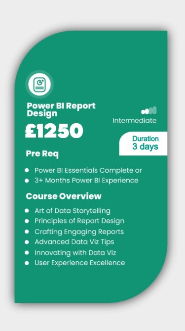
Report Design
Learn to create dynamic visuals with DAX, harmonise colours and themes, and enrich reports with images, videos, and gifs. By the end of this course, you’ll be adept at conveying critical insights quickly and compellingly. Moreover, you will have mastered the art of designing intuitive Power BI reports that tell compelling data stories and highlight key insights at a glance.
About this Power BI Course:
This course is focused on how to use Power BI Desktop to create effective reports by demonstrating several fundamental design concepts. Power BI Desktop comes with several tools for creating excellent reports. This course demonstrates how to enhance your reports with features such as drill-through, bookmarks, report page tooltips, conditional formatting, custom graphics, and more. The best practices and ideas for making your Power BI reports more interactive and useful are also highlighted. The principles covered in this course will provide you with a solid design foundation on which to develop impactful and compelling reports.
Prerequisites:
This Power BI training is beneficial for beginners as well as experienced Power BI users. If you have a basic understanding of Power BI, this class will help you fill in any knowledge gaps and upskill you with the right skills to create insightful reports. This course does not require any prior reporting experience or UI/UX knowledge.
Who should take this Power BI course?
This Power BI course is suitable for users who want to learn how to implement Business Intelligence solutions using top-notch visualization techniques. It is also appropriate for anyone new to Power BI and reports designing. If you have taken our Power BI Essentials Course (or already have experience using Power BI) and want to create more impactful Power BI reports then this is the perfect course for you!
WHY POWER BI TRAINING BY AMZ?
TRUSTED BY TOP COMPANIES
We’re proud to have trained employees from some of the most renowned companies in
the UK. Here’s a glimpse of companies we have had the honour to train:


Upcoming Dates
July
| Date | Day | Training Mode | ||
|---|---|---|---|---|
| 01/07/24 | Mon | Online/Classroom | ||
| 08/07/24 | Mon | Online/Classroom | ||
| 15/07/24 | Mon | Online/Classroom | ||
| 22/07/24 | Mon | Online/Classroom | ||
| 29/07/24 | Mon | Online/Classroom | ||
| Please contact us for further dates | ||||
August
| Date | Day | Training Mode | ||
|---|---|---|---|---|
| 05/08/24 | Mon | Online/Classroom | ||
| 12/08/24 | Mon | Online/Classroom | ||
| 19/08/24 | Mon | Online/Classroom | ||
| 21/08/24 | Wed | Online Live | ||
| 26/08/24 | Mon | Online/Classroom | ||
| Please contact us for further dates | ||||
September
| Date | Day | Training Mode | ||
|---|---|---|---|---|
| 02/09/24 | Mon | Online/Classroom | ||
| 09/09/24 | Mon | Online/Classroom | ||
| 16/09/24 | Mon | Online/Classroom | ||
| 23/09/24 | Mon | Online/Classroom | ||
| 30/09/24 | Mon | Online/Classroom | ||
| Please contact us for further dates | ||||
October
| Date | Day | Training Mode | ||
|---|---|---|---|---|
| 07.10.24 | Mon | Online/Classroom | ||
| 14.10.24 | Mon | Online/Classroom | ||
| 21.10.24 | Mon | Online/Classroom | ||
| 23.10.24 | Wed | Online/Classroom | ||
| 28.10.24 | Mon | Online/Classroom | ||
| Please contact us for further dates | ||||
November
| Date | Day | Training Mode | ||
|---|---|---|---|---|
| 04.11.24 | Mon | Online/Classroom | ||
| 11.11.24 | Mon | Online/Classroom | ||
| 18.11.24 | Mon | Online/Classroom | ||
| 20.11.24 | Wed | Online/Classroom | ||
| 25.11.24 | Mon | Online/Classroom | ||
| Please contact us for further dates | ||||
December
| Date | Day | Training Mode | ||
|---|---|---|---|---|
| 02.12.24 | Mon | Online/Classroom | ||
| 03.12.24 | Tue | Online/Classroom | ||
| 09.12.24 | Mon | Online/Classrom | ||
| 10.12.24 | Tue | Online/Classroom | ||
| 16.12.24 | Mon | Online/Classroom | ||
| Please contact us for further dates | ||||
complete the booking
Power BI Essentials Course Outline
Unit 1: Design Principles
✅ How to Communicate a Clear Story
✅ Creating Aesthetically Pleasing Reports and Dashboards
✅ Using the Right Visuals
✅ Information Reading Rule: Left to Right and Top to Bottom
✅ Report Design Rule: KPI
✅ Report Design Rule: Summarized Data
✅ Report Design Rule: Detailed Data
✅ Best Choice Visuals for Comparison
✅ Best Choice Visuals to Show Data Distribution
✅ Visualizing Relationships between Data
✅ Analyzing Data Composition
Unit 2: Introduction to Power BI Ecosystem
✅ Power BI’s Reporting and Authoring Tool
✅ Using Different Power BI Components
✅ Keeping the Ecosystem Updated
✅ Understanding Parts of a Report
✅ Sorting and Drilling Through Capabilities
✅ Introducing the Spotlight
✅ Understanding the Insights
✅ Introducing AI Visuals
✅ Working with Bookmarks
✅ Understanding Filter Propagation
✅ Creating a Dashboard
✅ Understanding Visuals Pane
✅ Understanding the Filters Pane
✅ Understanding Fields Pane Controls
✅ Page Navigation in Power BI
✅ Using Enterprise Power BI Templates
Unit 3: Basic Report Elements in Power BI Desktop
✅ Importing Custom KPI Icon and Image files
✅ Copying and Pasting Between Reports
✅ Adding Report Level Measures
✅ Introduction to the Ribbon Tabs
✅ Configuring Advanced Preview Options
✅ Features in Desktop vs. Reports
✅ Introduction to Various Data Connectors
✅ Creating Calculated Measures, Columns, and Tables
✅ Creating Hierarchy
Unit 4: Developing Reports in Power BI
✅ Creating the Report File
✅ Adding Filters and Slicers
✅ Adding Visuals and Report Elements
✅ Configuring Theme and Formatting
✅ Setting the Default User Experience
✅ Dynamic Column Headers
Unit 5: Report Filters and Slicers
✅ Understanding Filters in the Filters Pane
✅ Using Filters as a Slicer in a Report
✅ Filtering a Report, Page, and Visual
✅ Understanding Text filtering options
✅ Categorizing Date and Time Filters
✅ Understanding Date and Time Filtering Options
✅ Setting the Filter Status
✅ Creating Drop Down or List Filters
✅ Creating Number Filters
✅ Configuring Multiple Selections
✅ Editing Interaction between Filters
✅ Syncing Slicers
✅ Adding Place Holders
✅ Setting Background Colours
✅ Adding a Search Menu
✅ Formatting Options for a Slicer
✅ Copying Across the Report
✅ Snapping to Grid
✅ Configuring Buttons
✅ Using the Selection Pane
✅ Maintaining Layer Order
✅ Grouping Items Together
✅ Working with Time Intelligence Slicers
Unit 6: Understanding the Report Elements
✅ Understanding Report Elements
✅ Creating Charts/Graphs
✅ Creating AI Visuals
✅ Using Card Visual
✅ Using Spatial Data for Maps
✅ Introduction to Fields Pane
✅ Understanding the Format Pane
✅ Using the Analytics Pane
✅ Adding Text Box
✅ Creating Advanced Buttons
✅ Adding Shapes
✅ Adding Images
✅ Creating Card Visual with Icon
✅ Configuring Ribbon Chart
✅ Using TopN Filters
✅ Locking the Filters
✅ Creating Cluster Bar Chart
✅ Configuring Tooltips
✅ Creating Combo Chart
✅ Creating Line Chart
✅ Adding Analytics Lines
✅ Creating Scoreboard
Unit 7: Theme and Formatting Options in Power BI
✅ Introduction to Report Themes and Their Types
✅ Creating a Custom Theme Interface
✅ Setting the Visual Header Configuration
✅ Adding Image in Title
✅ Adding the Latest Date
✅ Creating Multi-Row Card
✅ Formatting Pages
✅ Enabling Always-Focus Mode
✅ Recommended Practices
✅ Final Formatting Method
Unit 8: Premium User Experience
✅ Configuring Pages
✅ Adding Slicers and Filters
✅ Sorting in an Order
✅ Configuring the Drill through the Location
✅ Difference between Workspace and App User Experience
✅ User Experience Options Available in Service
✅ Writing Comments in a Team
✅ Creating Dynamic Multi-Value Data Labels
✅ Learning How to Use Charts
✅ Recommended Practices
✅ Understanding Paginated Report
Unit 9: Conditional Formatting
✅ Adding Conditional Formatting
✅ Types of Conditional Formatting
✅ Adding Data Bars and Icons
✅ Adding Custom Icon Set
✅ Adding Web URL
✅ Using the Same Conditions for Multiple Visuals
✅ Conditions for Histogram Bins
Unit 10: Drill Through, Visual Interaction and Slicer Synchronisation
✅ Navigating From Summary to Detail Pages
✅ Configuring Cross Filtering
✅ Keeping Filters
✅ Setting Visual Interaction
✅ Duplicating Pages
✅ Configuring Measures in Filters
✅ Creating a Decomposition Tree
Unit 11: Basic and Advanced Tooltips
✅ Configuring Tooltips on Visuals
✅ Enabling Visual Header Tooltip
✅ Configuring Tool Tip Pages
✅ Using Smart Narrative Visual
✅ Adding Emoji in Visuals
✅ Adding Various Calculations in Smart Narrative
Unit 12: Bookmarks
✅ Quick and Easy Navigation Using Buttons
✅ Toggle between Charts Using Buttons
✅ Elements of a Bookmark
✅ Configuring Button States for User Experience
✅ Setting Button Effects
✅ Finding Anomalies in Data
Unit 13: Custom Visuals
✅ Importing Visuals from Marketplace
✅ Common Visuals in an Organization
✅ Importing Custom Visuals
✅ Custom Slicers
✅ Visual Cues
✅ Introducing Colour Helper by Okviz – Discuss
✅ Box and Whisker Chart
#1 Choice For Power BI Training